ShopDreamUp AI ArtDreamUp

Deviation Actions
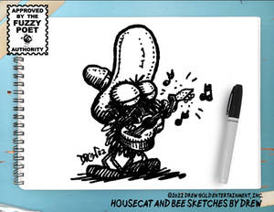
Monthly Strip Subscription (with Xtras!)
😂 Laugh your way through 2024! Motivational Housecat! is back, and it's bringing the comedy gold. Subscribe now for the wittiest, most absurd comic strips in circulation!
$10/month


Suggested Deviants


Suggested Collections


You Might Like…


Featured in Groups


Description
It's my entry for "Dark Side of Autumn - Autumn Melancholy" contest [link] held by #Trees-With-character
!!!I NEED ADVICE!!!
Should the part of the picture where forest is have beckground in slightly different colour or tone than right part with writting? O should I laft it whole white-grey as it is? What do you think?
I'm not sure, it's going to work on web-site, but in real size A4 or smaller A5 it looks impressive.
When I begun drawing this picture it was just idea popped in my head, but today, when I'm submitting it my feelings are somehow damn similar to it.
( black ink, red ing, white ing, pencil, PS-writing )
Image size
2487x1654px 3.11 MB
Make
HP
Model
HP ojj4500
Date Taken
Oct 26, 2012, 6:29:37 PM
© 2012 - 2024 great-queen-morrigan
Comments19
Join the community to add your comment. Already a deviant? Log In
simple and effective